Gouache Paints

My dear friend, Susan, gave me a gift of gouache paints for my birthday. I had no idea what gouache paints are and am a bit reluctant to use them. However, I did bring the paints with me on vacation, thinking it is a wonderful time to try something new.
Supplies you will need
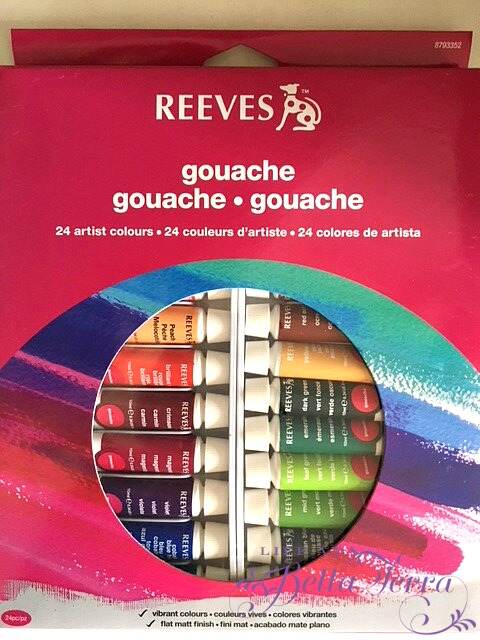
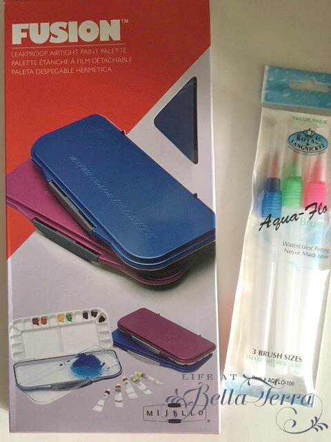
This gouache kit contains 24 artist colors and can be found here. In addition, Susan also provides me with an airtight paint palette (here) and aqua-flo brushes (here). For a minimal investment, you can start painting with gouache too!
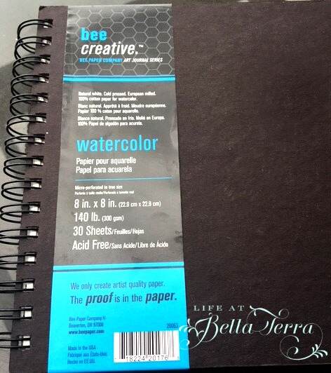
And I can always use a watercolor paper journal! This one is 8″ x 8″ and can be found here.
What are Gouache paints?
Gouache paints are more opaque than watercolor. The opacity of gouache comes from the white pigment or chalk that is added along with the colored pigment and binder in order to make it less transparent. So like watercolor, you add water to determine the strength of the color. I have little to no experience in watercolor, so this was a bit of a stretch for me.
Since we have been enjoying time by the Pacific Ocean, I am inspired by this artwork from professional artist, Gail McCormack.

Creating a sketch
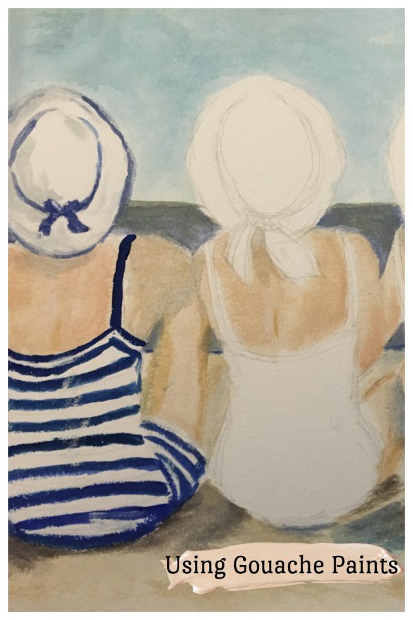
I first sketched the image on these watercolor 100% cotton sheets (in the art journal). The image above is rectangle, yet my sketch pad/watercolor sheets are 8″ x 8″. I tried to adjust the image to fit into the square space.

Mixing the Colors
This is the first time using this airtight palette. Apparently it keeps colors fresh for weeks, has a removable tray for easy cleaning, and can be used for oil paints as well. The individual wells make mixing colors and adding water easy and neat.
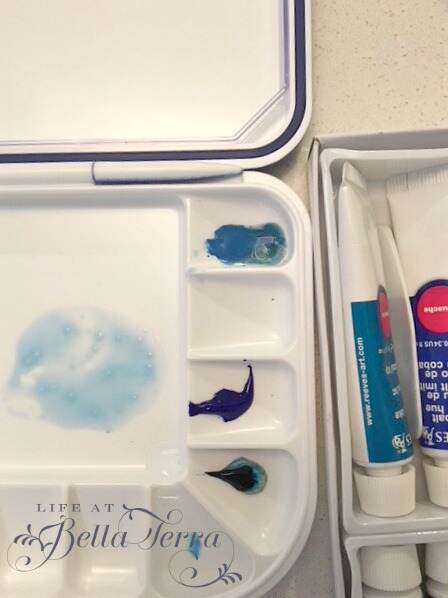
With a variety of colors to choose from the Reeves gouache kit, some are very familiar, and others I have not used before.
I mix a small amount of Blue Lake, Ultramarine, Medium Yellow, and white to get the sky color.
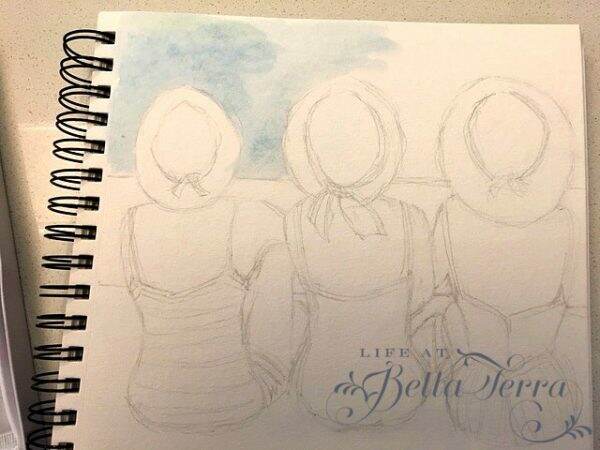
I quickly realize that watercolor goes on very differently than acrylics or oils. For me, it seemed a little harder to correct any mistakes. Next I paint in the ocean using a darker, richer shade of blue.
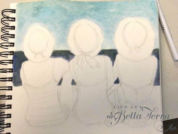
I struggle with making the sand color so light, as there is only one small tube of white paint, which I use sparingly.

Creating a proper flesh tone color is always interesting~~here I use yellow, white, and burnt sienna.
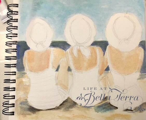
The fun part is painting the bathing suits and hats. I think the variety is cute and whimsical.
Finishing
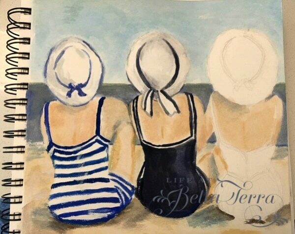
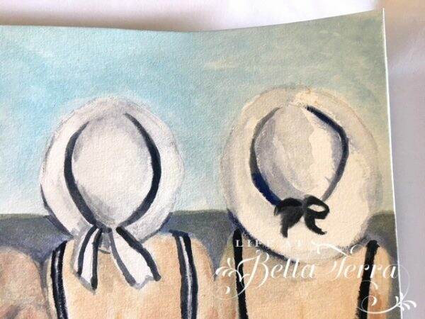
Though I am not completely satisfied with it, here is the watercolor to date. Still trying to figure out if I can fix some of the glaring mistakes, but that may require some research.
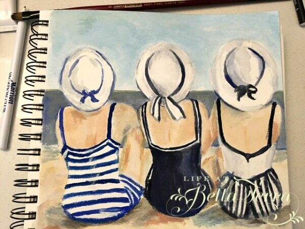
But I’m happy taking the leap to try something new. If you are to compare the original by Gail McCormack, she has done a much better job with the values and colors. But heck, she’s a professional artist and I am just starting out. What I love about her painting is that she also captures the serenity of the sand and ocean with her softened edges.

I hope you are trying something new and creative this summer! That’s what summer is all about~exploring new adventures.

If you enjoy this post, please share on Pinterest.
Just a reminder that any words that are italicized bring you to the source. If it is a product on Amazon, please note that I am an Amazon Affiliate. If you purchase something through my website, I receive a small (very small!) stipend, which doesn’t affect the price you pay at all. My goal is to make sourcing the items easy for you. Thank you for your continued support.

Oh wow! This is so neat and you did such a great job it looks better than the original!