Our Family Room
Our family room is one of the most utilized rooms in the house. I love the actual room as it feels like a solarium. It is my least favorite because I am not fond of how it has been decorated. Originally an outdoor porch, it was enclosed in the 1940s. The room is really large – 31 feet long by 16 feet wide. The other challenge is that all 4 walls have numerous windows and/or doors.
Below are pictures of the original room. Notice the fluorescent ceiling lights and the scored concrete floors. The only air conditioning was from the window unit, which died a few hours after we turned it on.
In the first photo, the exterior doors lead to the back porch. The interior doors go to the library and living room.

On the opposite end, the exterior doors lead to the front porch. This room runs the entire width of the southern part of the house.
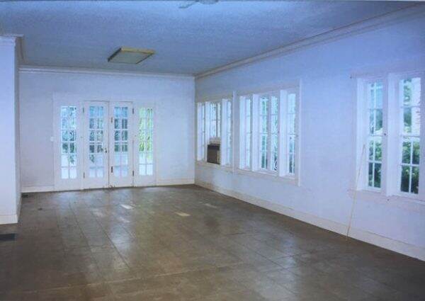
I have never been able to make this room “right”. The reason I am sharing this with you is that I am hoping you will weigh in on how I can improve this living space. Due to its size, I have split the function of this room in half. This side serves as the tv/family room.

Currently we have a very large, 96″ Mitchell Gold slipcovered sofa. I would love to replace it, but our dogs and cats seem to use it more than we do.
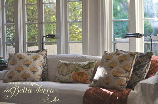
Even though the sofa has slipcovers, I added an organic cotton Coyuchi blanket that I purchased from Camps and Cottages that can be easily removed and washed weekly.
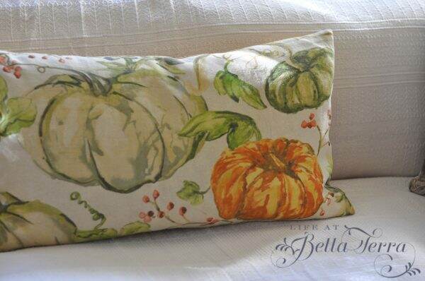
We weren’t the best at training our dogs when they were puppies, so they have run of this room. Cooper, our huge white dog, takes up most of the sofa as his nightly bed.

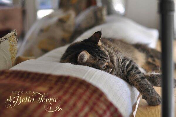
And the cats seem to like napping on the back of the sofa near the windows.
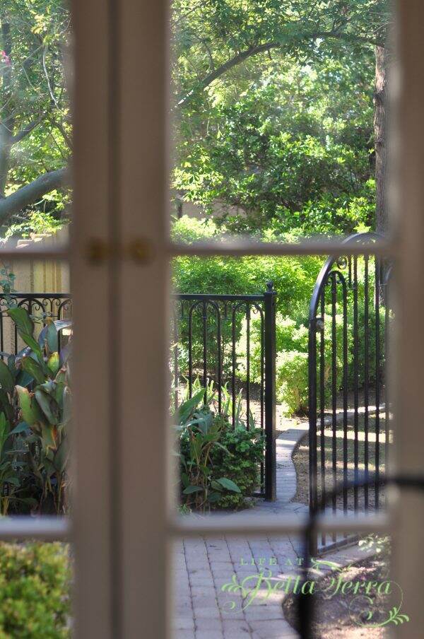
When we were restoring Bella Terra, I wanted to keep the original single-paned windows in this room. I love how the imperfections in the original glass blur the view to the outside. However, since we did not replace the glass with double paned panels, it is not energy efficient. As a result, this is the warmest room in the summer and coolest in the winter.
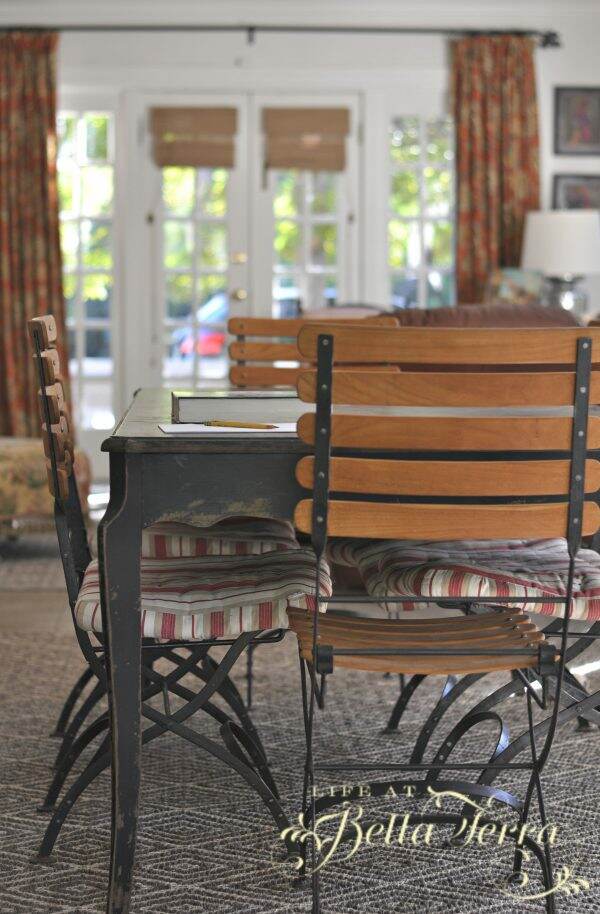
The other half of the room is more utilitarian. There is a large work table that is used for sewing, painting or school projects.

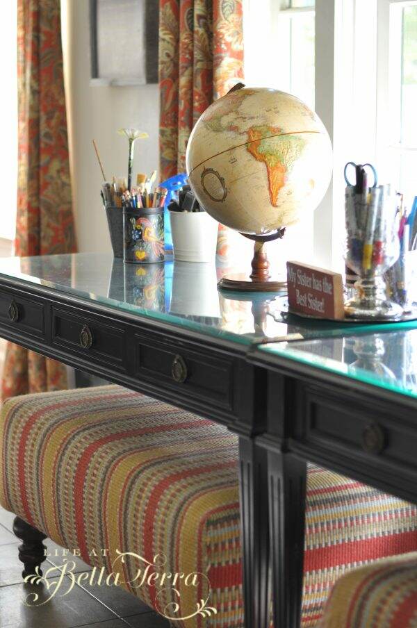
Along the wall under the windows are two desks side by side, with upholstered (using Dash and Albert rugs) ottomans for sitting. Here the computer and printer are easily accessible. With two out of my three children out of the house, I’m not sure it makes sense to still have these two desks.
I do love the two 9’x12′ natural fiber rugs I purchased from Ballard Design. They are such a nice quality and are holding up well to the wear and tear of the pets.

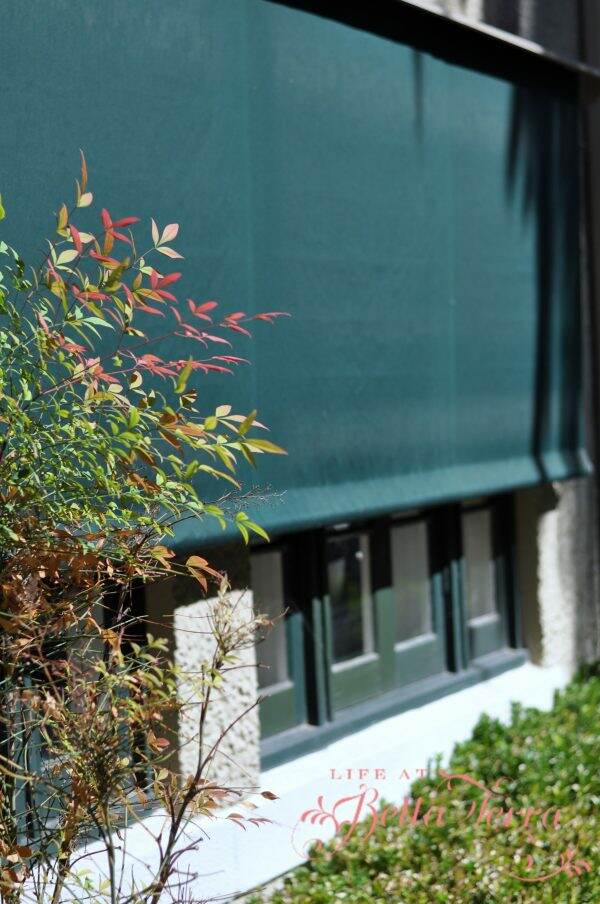
We installed remote controlled exterior shades made from Sunbrella fabric. This really cuts down on the heat during the summer months. It also reduces the reflection from all the windows on the television screen.
If you have any ideas or suggestions on how I can improve upon this room, I heartily welcome them. I feel a bit stuck with which design path to take. Part of me wants to take everything out and start again. Should it look more like an old porch? A greenhouse? But the reality is, this needs to be a comfortable, attractive, pet-friendly room.

Sunbrella shades by Phoenix Tent and Awning Company
Slat chairs were purchased from Relics Consignment and Antiques in Phoenix
Pumpkin pillow- Pottery Barn
Drapes by Country Curtains
Just a reminder that any words that are italicized bring you to the source. If it is a product on Amazon, please note that I am an Amazon Affiliate. If you purchase something through my website, I receive a small (very small!) stipend, which doesn’t affect the price you pay at all. My goal is to make sourcing the items easy for you. Thank you for your continued support.





Ok, I love this room also and it seems to me that you have decorated really well. I can see what you’re saying though about trying to get it just right. The windows are nice at the same time a wall to wall window concept can make the room seem like an unbalanced and really open space. The walls become less of the balancing forces and the furniture has to sort of replace that feeling. I would make the furniture a bit more ‘airy’, not quite a beach vibe but more towards that style and “create” walls by having the larger pieces of furniture face the center of the room. Ex: Sofa back facing center of room with sofa table behind it… the view towards the windows that are currently behind the sofa… you see? I hope I helped!
I took Interior Design courses when I was in high school, I thought that’s what I wanted to do with my life…changed my mind, but I still use what I learned about balance, harmony, and color to decorate my own home. Thanks for letting me weigh in on Bella Terra!
Great suggestions! I used to have an antique sideboard that divided the room, but when the desks were added, it felt like too much rectangular furniture. I do need to get rid of at least one desk. I love your idea of the sofa splitting the room with a table behind it. Thank you so much for taking the time to share your design tips!
I really enjoy Life At Bella Terra!!
That is so nice of you to say!