Reflections on the Glenn house remodel
My last remodeling project was probably the one that generated the greatest learning and the most heartache with unexpected challenges. Before I buy a home, it has to “feel” right. If you believe that the walls of a home speak to you, then you know what I mean. I can sense if a home has been filled with love and laughter and I also sense when they don’t.
So when I purchased the Glenn house, I could tell it was well-loved, well-kept, but out-dated. The house is situated on a small cul-de-sac with 6 other homes.
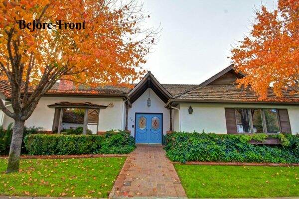
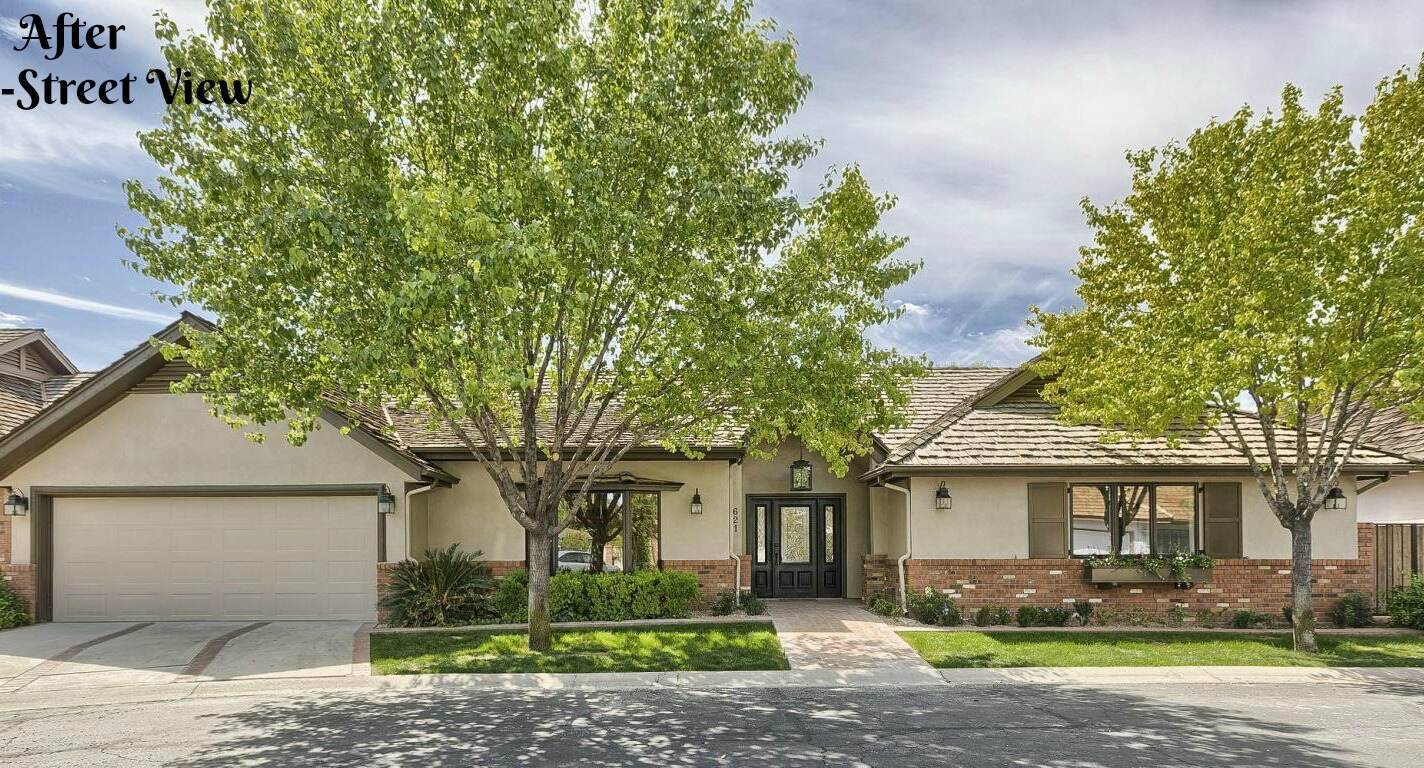
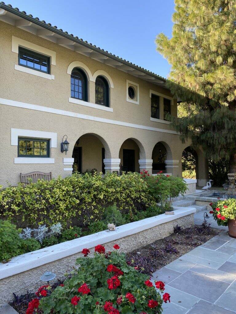
It had relatively nice curb appeal, except for the entrance. I felt like yodeling every time I entered the front door. Not sure why it was so Swiss Family Robinson looking, but it made the front doors look diminutive. The pendant light is the wrong scale. And look at those skinny posts supporting the massive vaulted ceiling….quite odd.
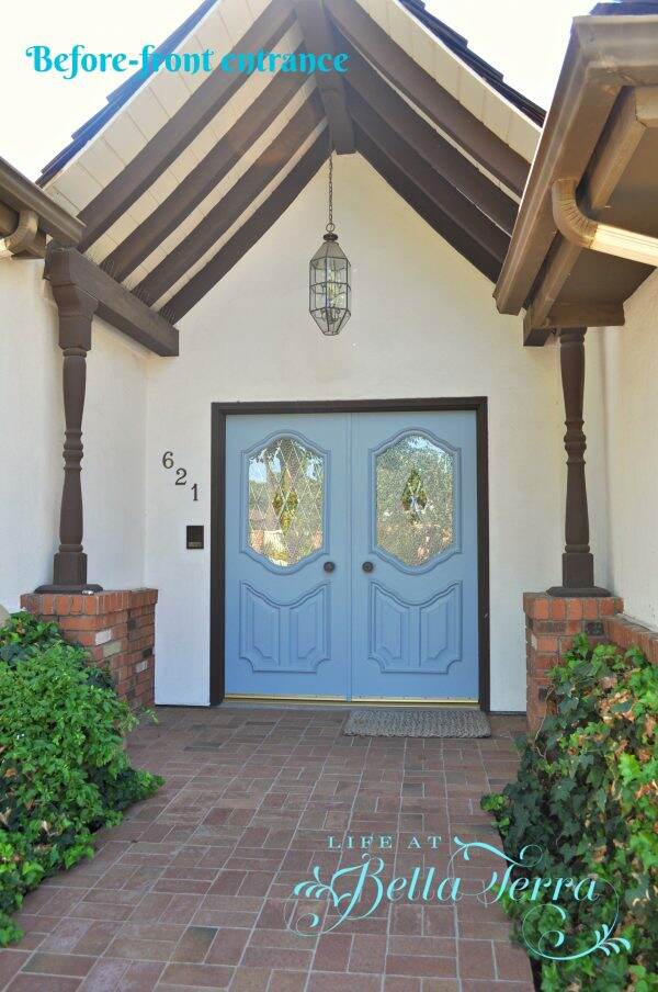
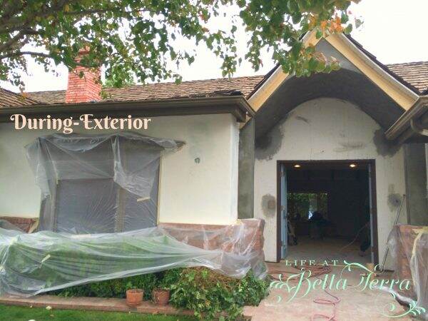
We removed the skinny posts and beams, and created an arched overhang and added more substantial columns.
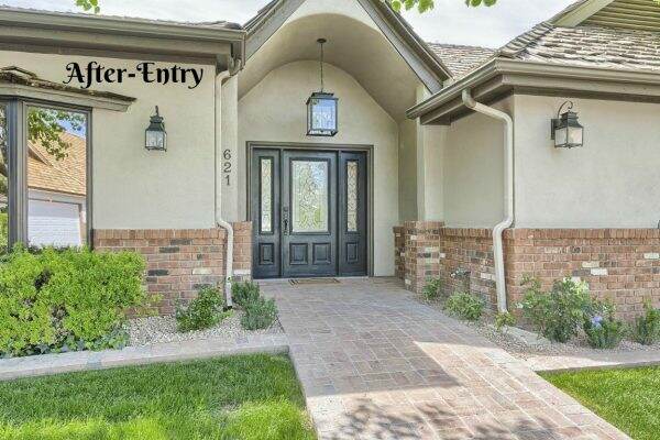
The after….new front doors painted black, new light fixtures, and richer paint colors. I replaced the overgrown ivy with healthier foundation plantings.
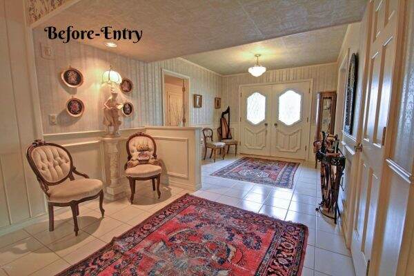
The entry had a low hanging soffit, a pony wall with dated wainscoting and my least favorite, tiled flooring throughout the entire house.
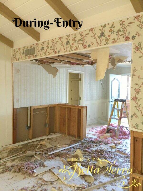
We eliminated the soffit because it interrupted the energy when you first walked into the house. We also removed the short wall, the floor tile, and the wainscoting.
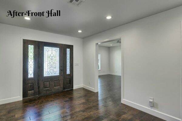
Here is the new entrance with a clean, elegant updated look with energy efficient LED can lights everywhere.
From the entry you walk into a wonderful great room. At the end is the entrance to the kitchen. Outside is a small patio area.
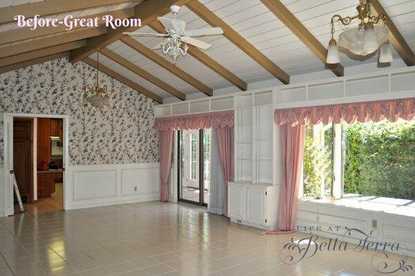
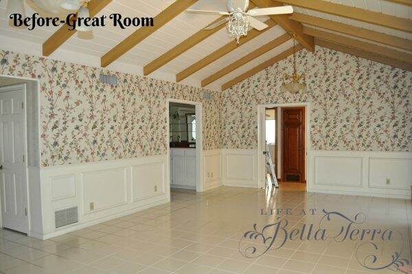
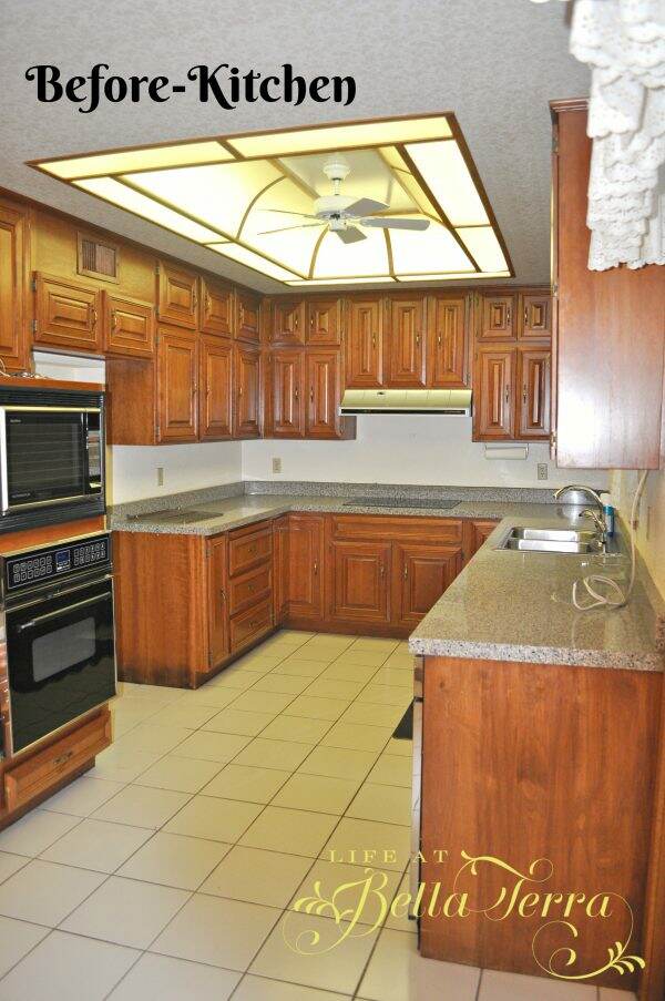
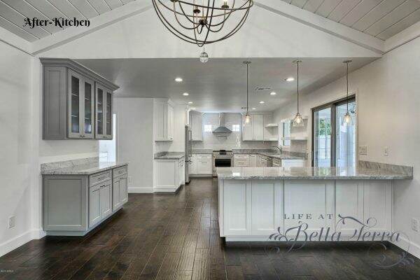
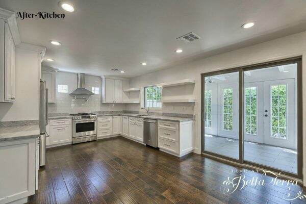
We removed all the built-ins and also took down the wall between the great room and kitchen. My first intentions were to just remove wallpaper and repaint. However, the house had a funny smell, which we attributed to its age. However, in removing the kitchen walls we found a huge rodent infestation and the insulation was saturated with urine and feces. We ended up removing all the walls, spraying everything with bleach and baking soda, redoing the electrical and plumbing and adding new, clean, fresh smelling drywall!!!!
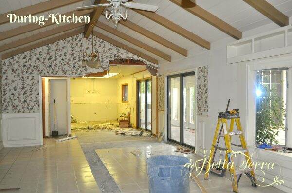
Every single house I have remodeled has this creepy loose insulation in the attic that is filled with dust and dirt. It’s a nasty job to remove it all and replace with new insulation, but I do it every time because I can’t stand this stuff.
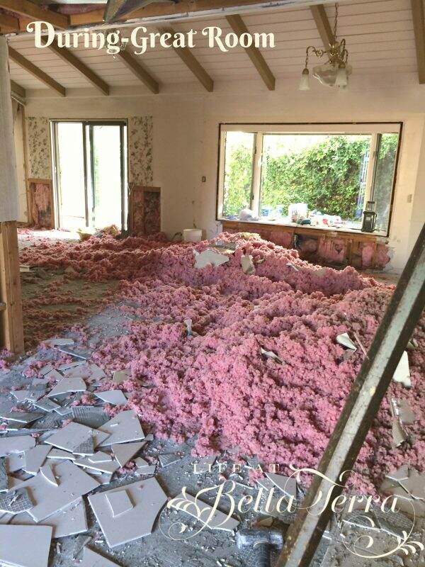
We painted the beams and removed one set of sliding doors and added Anderson casement windows. The new dark hardwood flooring against the crisp white paint makes for a beautiful contrast. The stunning new kitchen/great room creates a desirable, contemporary open floor plan.
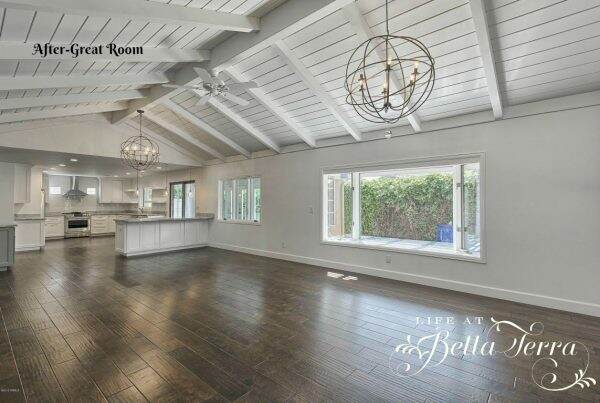
The large chandeliers are from Ballard Designs. The pendant lights over the peninsula are from Restoration Hardware.
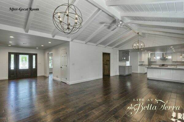
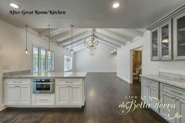
I don’t know how professional photographers do it, but they make the living spaces look so huge. This room is actually quite reasonable in size vs. the picture. Kitchen cabinets were custom built. Countertops are white Carrera marble.
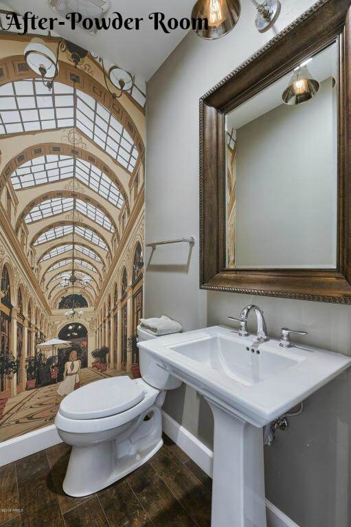
The powder room……such a small room, yet functional.
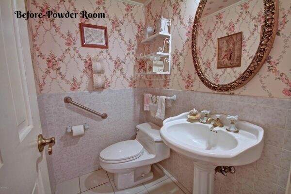
We removed the tile, replaced the fixtures and added this fabulous European wallpaper from Pixers to make the room feel bigger. I love adding a querky touch to each house I remodel. Light fixture and mirror from Restoration Hardware.
Next to the kitchen, was a den that we walled in and converted to a laundry/mud room.
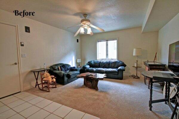
The cabinets are from IKEA. Personally, I love their drawer mechanisms and assembly was rather easy.
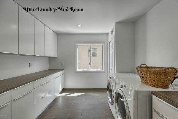
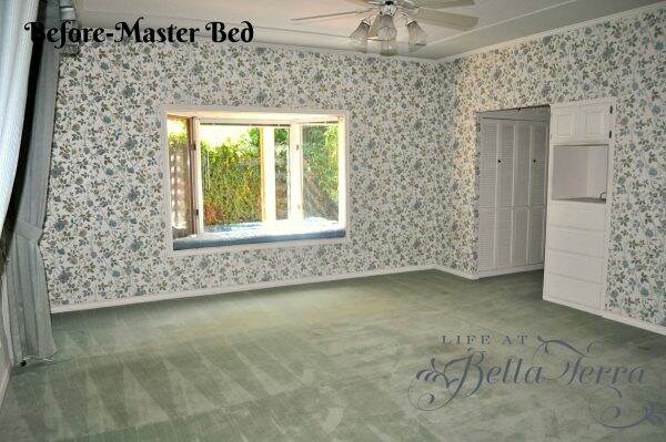
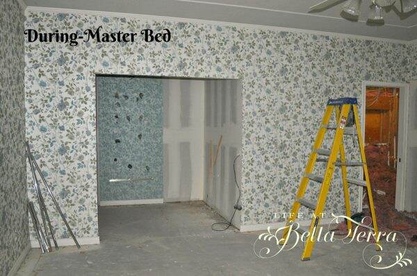
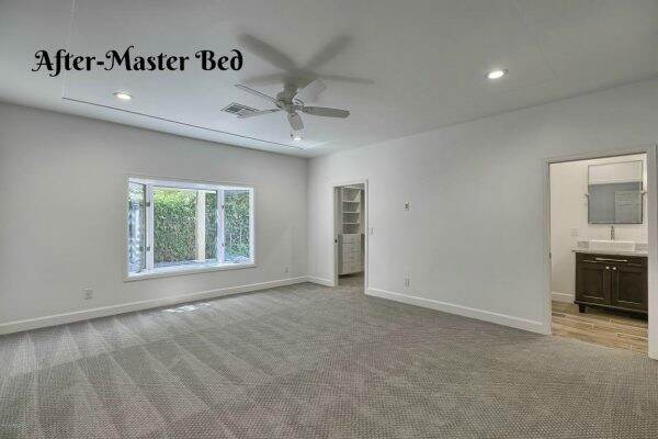
The master bedroom, like the great room, had lots and lots of built-ins and wallpaper. We removed them and added a real, larger closet by taking some footage from the enormous master bathroom.
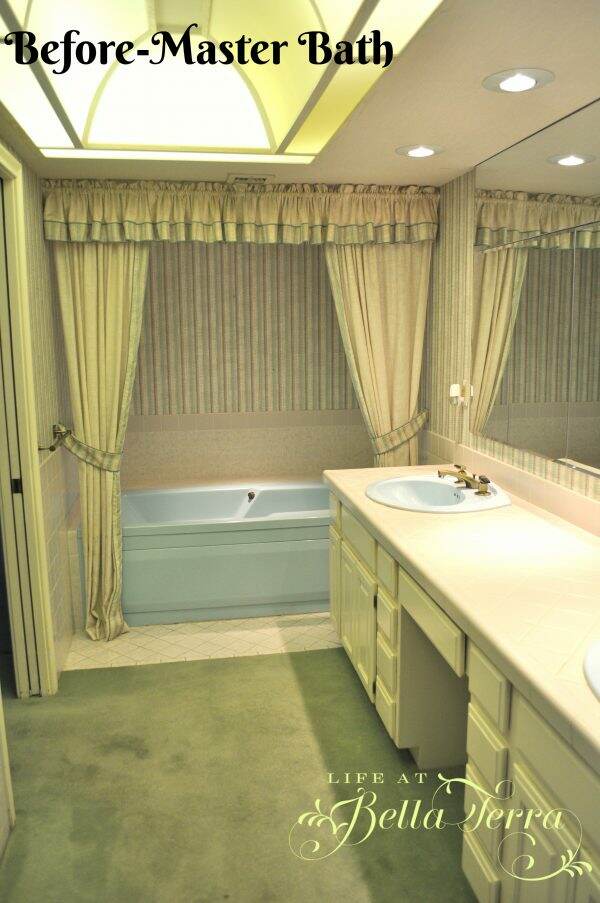
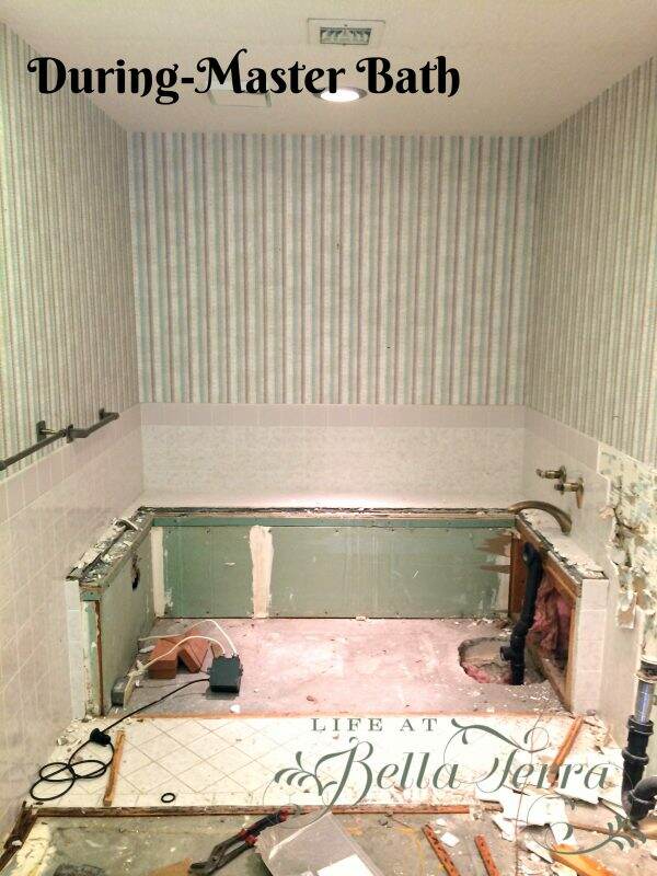
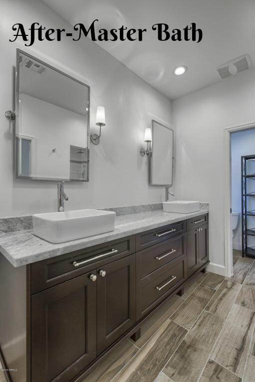
The master bathroom was well-equipped but required significant updating. It had what I call a “George Jetson” ceiling just like the kitchen. I am so happy those are no longer in style.
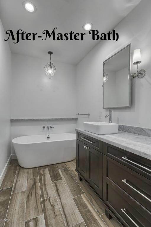
This is the first time I have used tile that looks like wood and I like the effect against the white walls and custom made vanity. Countertops are Carrera marble. Bathtub was ordered from Build.com.
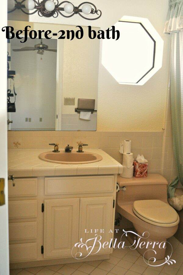
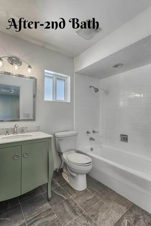
The second bedroom just needed cosmetic work, but the bathroom required a complete overhaul. The hexagon window really date this room which we removed and replaced with an operating one.
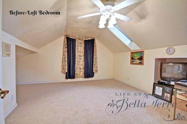
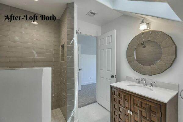
Most of the square footage of the house is on one level. There is a loft bedroom/office, which is rather large. We closed in the area with the shelving below and added a new, full bathroom.
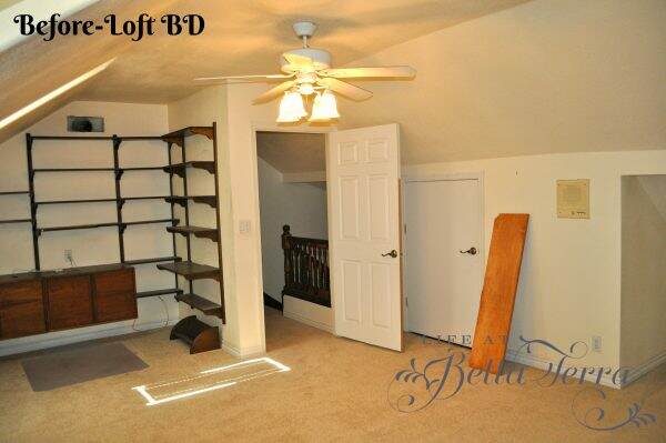
Love the curtains. There is no window behind them!!! However, we did add beautiful casement windows to capture the sky and rooftop views.
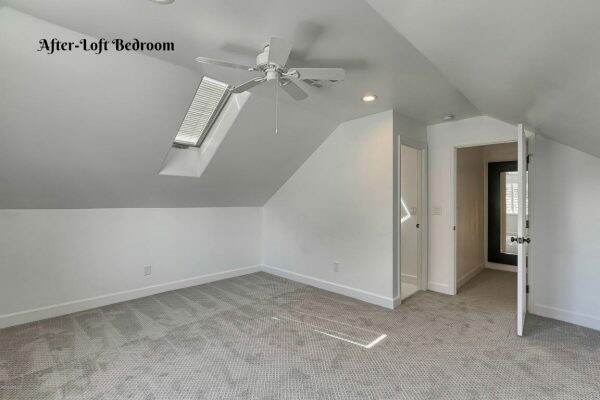
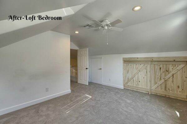
My sweet husband made the barn doors to cover the short closet/storage area, which is quite deep under the eaves.
Here’s the new bathroom that we added to the upstairs loft bedroom. At completion, this was a 4 bedroom, 3.5 bath home, all newly redone and sold to happy homeowners.
Many thanks to my dear friend, and realtor, Shelley Caniglia, for finding these treasured homes for me to remodel and restore. There are many more pictures to share and if you would like to see the Glenn project in its completion, click here.
The professional photographs of the finished home were done by Trevor Smith with Tour Factory. The “during” photos were done by me long before I even considered doing a blog so I will need some latitude on the quality :). Hope you enjoyed the tour of the Glenn house. Now back to work on the Willetta restoration!
![]()
Just a reminder that any words that are italicized bring you to the source. If it is a product on Amazon, please note that I am an Amazon Affiliate. If you purchase something through my website, I receive a small (very small!) stipend, which doesn’t affect the price you pay at all. My goal is to make sourcing the items easy for you. Thank you for your continued support.




Yeah, sometimes you gotta pull out your older work to remind you of how your new work will get accomplished. This house is beautiful and I love what you did in the powder room. I like that you kept the beams in the kitchen/living room. It must be really fun to do these types of renos!